A Mixologist’s Guide to Crafting a Magnetic Brand Colour Palette
Stir emotions and formulate actions through your brand’s colour
Like a master mixologist blending the perfect cocktail, designing a brand colour palette requires a mix of creativity, psychology, and strategy. There is an entire psychology for colours because it is a proven communication tool. We (designers) use colours to evoke mood, encourage action and influence emotion. In essence, it gets your audience to not only see, but feel what you want them to.
Colour is not just a visual element; it’s a powerful communication tool that evokes mood, encourages action, and influences emotion.
The lab report’s in: 60% of people decide if they’re attracted to a message based on colour alone? Just as every ingredient in a cocktail serves a purpose, every colour in your palette must be chosen with intention, aiming to boost brand visibility and recognition by up to 80%.
Amazing, right?
But what colours do I choose? Great question!
Choosing Your Brand’s Signature Colours Like a True Mixologist
The Base: Understanding Your Brand
Try describing your brand in five words or less. Whether it’s calming, sophisticated, or cheerful, these adjectives are the foundation of your colour palette. Like choosing the base spirit for a cocktail, this step sets the tone for everything that follows.
Eco-friendly brands might lean towards greens. Romantic brands towards deep reds. And calming brands towards light blues. This is about more than aesthetics; it’s about ensuring your colours align with your brand’s essence and target audience.
The Mixers: Colour Psychology and Theory
Mixing the right colours is akin to finding the perfect balance between sweet, sour, bitter, and spirit. Understanding colour theory helps in crafting a palette that not only looks good but feels (and tastes) right.
Your colours need to reflect not just your business but you, too.
Authenticity in your choices connects your brand more deeply with your audience, making it memorable and meaningful.
What to avoid when choosing a colour palette
Avoiding Common Pitfalls Trendy vs. Timeless
Yes, if you’ve been in business for a while now, you will need to update your brand to remain relevant. However, it is essential to opt for colours that will remain timeless instead of trendy.
Trends in colours are like seasonal cocktails; they’re exciting for a moment but quickly replaced (like the Vegemite cocktail I saw on a recent Australia Day cruise – and no, I was not brave enough to try that)! Be a spicy marg in a sea of Vege-jitos. A brand that relies on trends often gets lost in the mix with a diluted message.
The cherry on top:
- Choosing timeless colours means fewer updates to remain relevant!
- This leads to more substantial brand recognition. And, we now know that brand recognition helps consumers easily identify your product or brand and builds trust!
The Perfect Blend
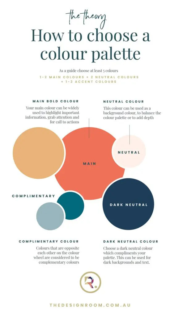
A well-crafted colour palette, like a well-crafted cocktail, contains about five colours – or ingredients. (at a minimum). This blend allows for versatility while maintaining brand consistency.
- Main colours grab attention
- Neutral colours provide balance
- Accent colours add depth and contrast
Remember, a harmonious palette includes a balanced mix of tones, tints, and shades. This creates a visual experience with as much flavour depth as your favourite cocktail.
The Finish: Tones, Tints, and Shades
Balancing the light and dark, the bold and subtle, ensures your palette works across various applications. Think: a cocktail menu that works for brunch and evening, on the rooftop and in the lounge area.
If the task feels daunting, a brand designer is your go-to mixologist. Your dedicated maker and shaker to guide you to a palette that resonates with your audience and embodies your brand’s spirit.
Let’s concoct the right combination of elements and create something truly unforgettable. Whether you’re refreshing your brand or starting anew, the right colour palette can be the secret ingredient that sets you apart, making your brand not just seen, but felt.
Ready to pull up a stool and chat all things branding?